B&W or Color? Pick one and go with it.
- Petr Svitil
- Sep 19, 2021
- 2 min read

Recently I’ve seen an increase in the number of memes about people adding color film borders to a B&W image. I joined in on the fun initially but realized after a while that some film photographers genuinely converted the color image to B&W in post.
In the past year or so I’ve witnessed a rise in the number of photographers who post both the color and B&W version of a single image and I don’t think that’s a good idea. We’ve all heard it before, “you can’t take any old color image, turn it B&W, and expect it to be a good B&W.” The magic of B&W is that it strips away the distractions of color. Color is the first thing our eyes perceive, so if you take it away our brains immediately move on to the next more recognizable thing; the human form. This is why in B&W images we first notice people and are able to concentrate on them more.
When I see a post of a color image on IG, and swipe to the next image which is identical but in B&W form, the colors of objects are still embedded in my mind from just a second ago. It dilutes the value of B&W. It doesn’t feel like a well made B&W but rather like a dulled down version of the color image.
I also frequently see photographers post gorgeous images, proving their skill, and following it with a question: “do you prefer it in color or B&W?” Shouldn’t the artist tell me what I desire? Show me the best version of your image, and only the best version. Don’t dilute it with mediocrity. Less is more.
Take this image I shot of the kids at summer camp. If the image was in color, the straw hat would blend with the wood ceiling to create a combined half a frame of yellow-ish negative space; the sheer size of which would be the first thing you’d notice. Since there is no color, your brain first starts to look for a human; in this case the centered and full face of Mareček. Then you likely notice the profile of Markét holding him. Then perhaps you notice the symmetrical patterns on the straw hat and later the leading lines of the ceiling beams. But the focus remains on Mareček’s front and center face.

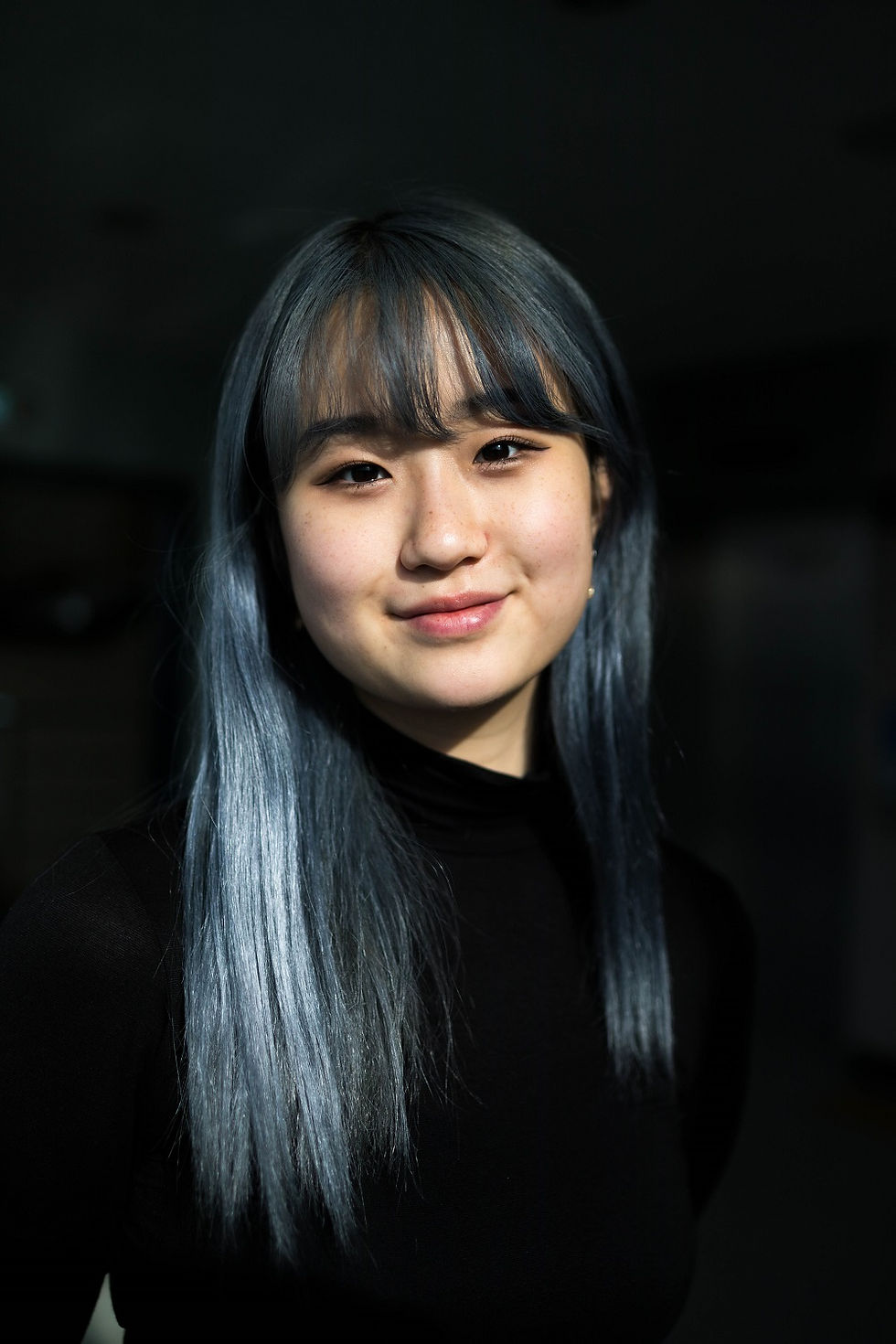
That being said, not all images benefit from being black and white. If you look at the portrait of Zoe, turning it into B&W would make her hair blend with the dark background, losing the distinct separation. You’d also lose her skin’s beautiful golden glow from the late afternoon sun as well as some details like her freckles and the gentle rogue of her cheeks. Most importantly, in B&W the direct light would create distinctive and harsh shadows by her nose and under her chin which would draw your attention away from her as the strong hard cutting contrast would take precedence.


Comments